YouCaring
I led Hi-Fi development & prototyping for YouCaring's first iOS-native fundraiser management app. Read on for some interesting challenges with IA.
“Mark lead our Hi-fi design and prototyping efforts for our native mobile app. He was able to translate findings from earlier user tests and build a simple easy to use interface that was consistent across all areas of the app. I was thoroughly impressed by Mark’s attention to detail and ability to create simple solutions to non-standard interactions. Great quality work and easy to work with.”

Project:
Create the IA, UX, and UI conceptual foundation for YouCaring's first iOS-native fundraiser management app. At the time of the project's start, YouCaring had a partial, new Styleguide so the team would be influencing that as well.
Company:
YouCaring, a compassionate crowdfunding platform. What differentiates YouCaring is that they rely on tips from donors, not on a cut of donations as similar platforms do. People trying to help loved ones by raising money through a YouCaring campaign end up with all of the donations (with the exception of what credit card companies take).
Role:
Lead roles
• Led Hi-Fi development and prototyping (including icon design and key deliverable files)
Team roles
• Evaluations of the current and competitive products.
• Journey Mapping
• User Testing (led one and observed as many as I could)
Project Manager: Leanna Leung
Goal
Design a native iOS mobile app to help organizers using YouCaring’s crowdfunding platform be more successful with their fundraisers and increase engagement with YouCaring.
The app is scheduled to be released some time in 2018 and we'll be looking closely at engagement metrics for signs of success once it's released.
Challenges
There were challenges we were aware of up front and challenges we wouldn't discover until well into the project.
An Unfinished Styleguide: We were designing a new app but not a new brand. YouCaring on the other hand was redesigning their web branding and we had to create our app with only a partial web styleguide as compass. Thankfully, YouCaring allowed us some freedom and wanted us to be a part of the collaboration, not just emulate their existing web look and feel. There would be some confusion as to how much influence we could have, though. That led to a couple resets in icon design and, ultimately, a distaste for FontAwesome.
Back-end Architecture vs Intuition: The locations some people thought certain features would be did not always match how that information was engineered at the back-end.
We had to bridge the gap in some users' instincts with our own instincts and engineering realities. This wasn't obvious to us until we were well into the project and the project went so fast that it we would end up struggling over feature location from the first prototype test until just before the final hi-fidelity work was done.
IA Challenge 1
Switching between multiple fundraisers was the function that was the most difficult for us to resolve. Both places we tried to structure it had their detractors. That story starts to appear before validation but user testing was when the awareness really hit home.
IA Challenge 2
The second biggest challenge was where to structure access to users' banking information which can be custom for each fundraiser and have multiple options. We almost gave this its own tab.
Competitive Research
If there was one clear takeaway from examining other crowdfunding platforms, it's that they were all trying to be supercharged sharing machines. Maximizing engagement was a clear focus. As one example, GoFundMe's dashboard's main feature is a carousel of eight 'encouragements' to share, sometimes supported by statistical data.
GoFundMe limits payment options to one channel (WePay) and the added layers of managing payment multiple options for each fundraising campaign don't come into play (but it also limits users options). We weren't yet aware how much we would struggle with the trying to structure multiple money sources.
What Did People with Crowdfunding Experience Have to Say?
Interviews including users of GoFundMe, Kickstarter, Crowdrise, Indiegogo, etc.
We sought to identify their social media habits and understand their overall experiences and impressions with crowdfunding.
The interviewees said they felt Facebook, Twitter, and email were the channels that produced the most success. That led us to favor those in interface decisions. People we interviewed showed a need to be in control of their messaging and worried that a platform could spam their friends and family without their approval. This led to making sure the app was transparent about where a message was being sent during message creation.
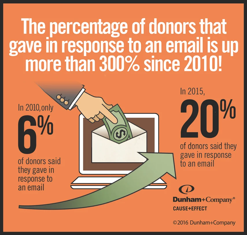
Finding: Social Media Critical to a Fundraiser's Success
Charitable giving through online social sharing is rising and the research from Dunham & Co. confirms what we learned from interviewing those who had run their own fundraiser. When designing the app, we would work to ensure that sharing through favored social channels was easy and available.

Finding Opportunity with Journey Mapping
I participated in a journey mapping session with the goal of focusing on the end-to-end experience. Because of the likelihood of users being in an emotionally troubling time while running a compassionate crowdfunding campaign, it was important to include not just the interaction with the platform, but also the emotional journey. If there were gaps in providing for user needs, this map could make us aware of them.
After the initial journey mapping exercise, I created a graph showing how user needs for the app related to the users' emotional path and listed out opportunities for YouCaring at each phase of the journey. The biggest benefit of the exercise to the team was to create deeper empathy for the complete user experience at every phase. The biggest benefit to YouCaring was to highlight the need for coaching those running a campaign to keep momentum (and donations) going once they’ve started if they’re uncertain about the best way to do that.
A Design Studio Exercise Full of Rapid Iterative Design Helped to Kick Things Off
We had the familiar challenge of having far too much to do in the time available. We used a design studio to help to kickstart the overall design and layout of the app. We spent about 5 hours sprinting though repeated sessions of rapid iteration and review. It would be a little difficult to detail the whole process as the 5 hours seemed to rush by in a blur of chaos and doodles.
I think we took too much on for a single Design Studio session. Designing the foundation for a whole app in one session was diluting the benefits of a Design Studio. This exercise would be better suited to ideating for a single feature or single tab section at most. Still, much good came out of it.
This exercise was helpful in laying the groundwork for an overall flow however it would take prototyping to uncover our biggest challenges to making the experience straightforward.


My UI Sketches
Our Biggest Challenge: Information Architecture
Here's our first major struggle. There are two distinct and different locations for switching fundraisers. Each location can be argued for, but choosing both means slightly different logic will be experienced in each case... and it made it difficult to isolate problems with one or the other in testing.
The back-end structures banking info with the Fundraiser, not the User Profile as it's shown on the right. The location on the right might work on its own but I would argue that it if it was, it should be connected directly under My Fundraisers (right above its current location).
The left and right of this diagram would change quite a bit before we were done.
Findings/Changes After 1st Round of User Testing
I love watching users as they're using a prototype. Too much is missed in user testing results on a spreadsheet and I think it's by far the best way to get a feel for users. So I try to participate in as many as I can. I led one as well but I'm clearly better at witnessing. Here are some insights from our first round of testing.
Lo-Fi V2 Prototype
User Testing Insights After V2
3 out of 5 tested thought they could switch their fundraiser on the Dashboard. We were happy to hear that when most people think of a Dashboard, they think of ALL of their fundraisers. These were the 3 users I wish we had in the first round of testing... they validated one of our first ideas for placing this feature.
So we added a 'Switch Fundraiser' dropdown back to the Dashboard AND to the Updates and Supporters tab (because those tested on V1 didn’t know which fundraiser they were managing when on other tabs, now they wouldn't be left to guess where they were) .
That Other Problem
YouCaring fundraisers are structured so that bank account information is unique to each fundraiser.
But users' mental model usually brought them to their "Account" tab when wanting to access that information.
If this was a potential disconnect, it wouldn't affect most users who had only one campaign. But since each account holder can have multiple accounts, and this group was not insignificant, there would be plenty of users who could have struggles.
In the compassionate crowdfunding world...
Though ~12% of accounts have more than one fundraiser, those accounts generate nearly 22% of total donations.
This led us to revising the location for the banking info in the Hi-Fi phase.
The Hi-Fi Design Team Is On The Job
This is the phase I led. I had a small team to help me put together the approximately 40 screens needed to prototype the most important features we wanted to present to the client. Once I was able to combine the screens I created with my team, I scrubbed all the graphics for consistency and alignment and consolidated symbols and styles.
A New Information Architecture
The new structure puts the Fundraiser Selection at the Fundraiser level instead of the Account/Profile level to match the structure of YouCaring's back-end.
More Testing, More Insights
Resolving the location of banking info: We were fairly confident that the banking info was now in the place it should be, but then 3 out of 5 users did not realize they could find their banking info in "My Funds" and went to the "Account" tab instead.
We then changed "My Funds" to "Manage My Funds" to suggest there are actions to be taken related to funds.
Another Small Big Change
Only 1 out of 5 specifically mentioned wanting to thank donors a second time but since this was in keeping with our goal of helping users maintain momentum and increasing engagement, we changed “Thanked!” static text to a “Message Again” button.
Tab Bar Icon Story
Icons weren't expected to be a part of the scope of this project but I enjoy the creative challenge of making graphics that readily convey meanings of features but also have attributes of the brand.
The Final Prototype
Growth?
70% of YouCaring's users are women in their 30s and Pew research indicates that most people creating fundraisers are younger women. However, this research claims that those aged 40-59 are the demographic most likely to give online and grew from 47% to 67% from 2010 to 2015. This looks like an opportunity to convert those comfortable with online donation into YouCaring campaign creators. My 2¢.
Other Thoughts
Repeating my thoughts on the Design Studio... using it to try to layout the better part of an app diluted the efforts too much. Our timeline seemed to be telling us we had no choice. The Design Studio seems better suited to a smaller focus, like a single feature. I also think Design Studios fall victim to the same problems that brainstorming groups have. To save you clicking on that link... this sums it all up:
“Over 50 years of research shows that people often reach irrational decisions in groups … and highly biased assessments of the situation... strong willed people who lead group discussions can pressurise others into conforming, self-censorship and create an illusion of unanimity.”
If I had a 'do over' in the Hi-Fi effort, I would create a more developed template to hand to the team. I did provide a pre-defined palette of branding colors but I should have better defined the grays that were outside of the brand. I ended up with quite a few grays and spent a lot of time consolidating.
Design Intent & Engineering's Recommendations
Design Intent
Here are the four tabs. Our design shows the ability to switch from one fundraising campaign to another on every tab that is controlled under a campaigns umbrella. It's convenient and the user can always see which fundraiser they're taking action on.
Engineering's Recommendations
YouCaring's engineer noted that having a 'choose fundraiser' dropdown in certain tabs could cause too many calls and some information could get dropped. So he proposed a fixed header that still showed the fundraiser name on it for the Updates and Supporters. The Dashboard would be the single point of switching fundraisers. I think this a very reasonable solution... it preserves the ability to identify the fundraiser from all 3 Fundraiser-level tabs and it's a menu on the main focus, the Dashboard. And it would look like this...
YOU ARE AWESOME! You made it all the way to the end! Here are some photos of Leanna's cat Pickles, the cat that was the model for our fundraiser mockup.